Wednesday, November 5, 2014

Two Charts On Why the Obama Economy Sucks

Source: Ian Welsh

The Employment-Population Ratio (from the BLS):

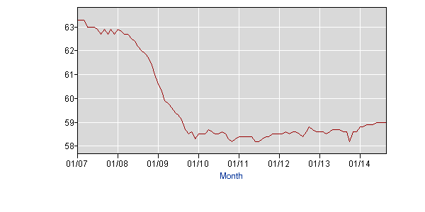
Median Household Income:

http://research.stlouisfed.org/fredgraph.jpg?hires=1&type=image/jpeg&chart_type=line&recession_bars=on&log_scales=&bgcolor=%23e1e9f0&graph_bgcolor=%23ffffff&fo=verdana&ts=12&tts=12&txtcolor=%23444444&show_legend=yes&show_axis_titles=yes&drp=0&cosd=2007-01-01&coed=2013-01-01&width=670&height=445&stacking=&range=Custom&mode=fred&id=MEHOINUSA672N&transformation=lin&nd=&ost=-99999&oet=99999&scale=left&line_color=%234572a7&line_style=solid&lw=2&mark_type=none&mw=1&mma=0&fml=a&fgst=lin&fq=Annual&fam=avg&vintage_date=&revision_date=
All of the blather about how the unemployment rate has decreased, the stock market is up, and so on, conceals the fact that there are less jobs for ordinary people, and they pay less.  Yes, the rich are doing great, but that’s all.
Why are Democrats losing the Senate?  I won’t say it’s just this, it’s not.  But if the economy was actually good for most people, they probably would be holding it.

No comments:

Post a Comment