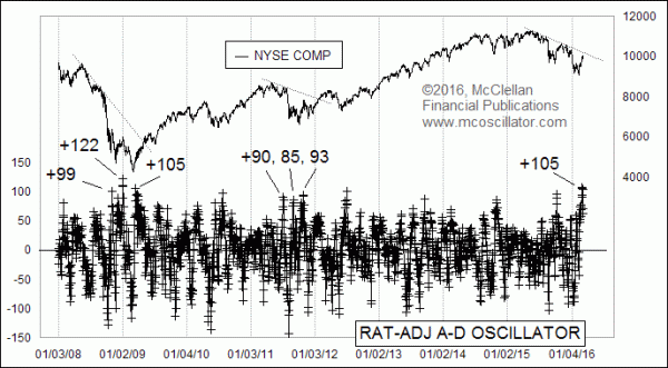
On March 3, the McClellan A-D Oscillator hit a reading of +332, which was its highest reading since the +386 reading seen on Jan. 6, 2009. The cause of that high reading has been a big surge in positive breadth days for the NYSE ever since the Feb. 11, 2016 price low. The meaning of it, however, is an open point for discussion.
During uptrends, a really high McClellan Oscillator reading means that there is a surge of liquidity, and it promises higher price highs on the ensuing move. Usually we look to a level of +150 or above on the normal McClellan Oscillator, or +50 and higher for the Ratio-Adjusted McClellan Oscillator (RAMO) shown in the chart above. The RAMO factors out the changing numbers of issues traded, which can affect the amplitudes of the normal McClellan Oscillator, and thus the RAMO is better for making long term comparisons.
In a bear market, however, it is possible to see a really robust countertrend rally that produces a high McClellan Oscillator reading, and which does not carry the same meaning as when we see a high reading in an uptrend. So to make a proper interpretation of this most recent high Oscillator reading, we need first to understand whether we are in a bull market or a bear market.
That +386 Oscillator reading back in January 2009 offers us a great case study to amplify this point. On the RAMO, that was a +122 reading, so the most recent RAMO reading of +105 is comparable. That January 2009 Oscillator spike was not the start of a strong new uptrend, although it felt like it at the time for a lot of people, and then prices went on to fall to a lower low in March 2009. Finally in late March 2009, we saw another high Oscillator reading that did mark the start of a new uptrend.
We saw a similar situation in 2011, at the end of QE2 when the sudden end of the Fed’s money pumping activities caused a lot of price volatility. RAMO spikes to +90 and +85 were just countertrend rallies in a downtrend. Eventually that 2011 downtrend ended, and another RAMO high reading did mark the initiation point of a new uptrend.
My interpretation is that the current market situation is still a downtrend, and thus that the recent +105 RAMO reading was a sign of a bear market rally’s climax. This interpretation comes in part because the market is supposed to be in a downtrend right now, according to my eurodollar COT leading indication which I discussed here back in August, and which is a regular feature in our McClellan Market Report newsletter and our Daily Edition. That model calls for another drop to a bottom ideally due the first week of April.
If we see another really high McClellan Oscillator after that upcoming bottom, then such a prospective high Oscillator reading would be more likely to mark the strong initiation of a new uptrend.
Because the recent Oscillator high was the highest one since that January 2009 Oscillator high, it occurred to me to compare the two price patterns. Check out this comparison, with the price plots aligned as of the high Oscillator days:
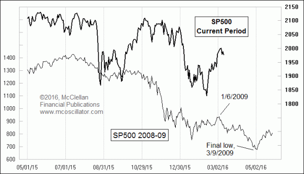
It is not the best price pattern analog ever, but there are many points of similarity which do lend support to its validity. If the current market were to follow this prior pattern exactly, then that would imply a bottom in early May 2016, rather than the early April bottom suggested by the eurodollar COT leading indication. But it has not been following it exactly.
Bottom Line: A really high McClellan Oscillator can sometimes mean strong upward initiation of a new uptrend, or other times it can mark a climax of a bear market rally. So having an understanding of the market environment in which you see one of those readings is essential for interpreting it accurately.
Editor, The McClellan Market Report
No comments:
Post a Comment