These two charts depict the same index
(DJIA) over the same time frame, but they reflect two stories and two
economies.
Long-time correspondent Harun I. recently
submitted two charts of the stock market that suggest two different
stories–and these two stories suggest two different economies.
The first story is the one the Federal
Reserve wants us to believe: the economy is expanding
smartly without inflation or deflation–in effect, a Goldilocks
economy that is enabling expanding profits and margins, which have
pushed stocks ever higher.
In summary, this is the happy story.
The other story is the Fed’s nightmare
scenario: the stock market’s expansion is exhausted and
poised to decline. This story is one of an economy that never
expanded in meaningful fashion, and a stock market rigged to rise by
unprecedented intervention (i.e.manipulation) by the Fed.
This is the not-so-happy story.
These two charts depict the same index (Dow
Jones Industrial Average (DJIA) over the same time frame, but they
reflect two stories and two economies. These divergent
stories are possible because the data supports two parallel
universes: one in which the booming market is held up as evidence the
overall economy is expanding to everyone’s benefit, and the other a
manipulated market that has expanded not as a reflection of growth
but of a staggering loss of purchasing power of the U.S. dollar and a
central bank transfer of wealth from the many to the few who own the
majority of financial assets.
Here is Harun’s commentary:
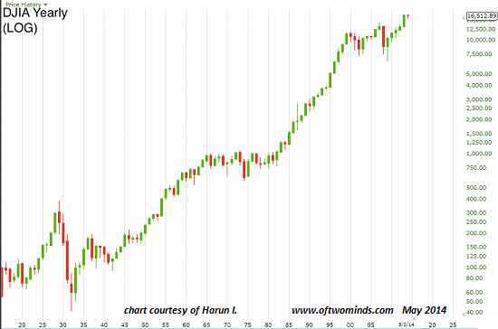
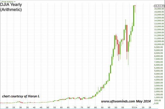
Below are two charts of the DJIA. The
periodicity is yearly, i.e. each bar is one year. One is arithmetic
and one is log. They present two dramatically different perspectives.
The log chart puts gains into a relative
context and I use them extensively. However, the one drawback I find
is that they are a poor indicator of psychology when using the bars
to gauge sentiment.
The log chart indicates nothing unusual but the
arithmetic chart indicates that we should be asking ourselves whether
last year’s bar suggests a high probability of exhaustion. The log
chart allows the Fed and others to claim, “see, no ‘flation”,
i.e., no inflation or deflation of any sort.
Yet when we look at the relative strength
charts and see that when measured against gold and equities,
commodities are, in many instances, at all time lows.
The cheers go up–if you are of the small
percentage of people who own these assets (gold and equities). But if
you are one of the 99.90%, everything has gone up except your
paycheck; 1 out of every 6 are on food stamps. In the case of
the majority, inflation is everywhere. If you’re in the
one-third of the working age population that is unemployed, there is
no hope in sight.
The arithmetic chart, on the other hand,
shouts, “Warning, something is really wrong here!” It
says that either the wealthiest people (those who own equities) are
really excited about the economy’s growth opportunities, or they
are fearful and taking advantage of the transfer of wealth being
orchestrated by the government via the Fed.
One can choose which narrative best fits. To
paraphrase former president Clinton, it just depends what on your
definition of is, is.
Thank you, Harun, for explaining the two narratives the charts tell. I suspect the divergent stories will be compressed into one narrative in the next few years: either the overall economy matches the optimistic forecast of the stock market, or the market declines to the recessionary stagnation of the Main Street economy.
No comments:
Post a Comment