Human emissions of carbon dioxide began a sharp rise from 1945. But, temperatures, it seems, may have plummeted over half the globe during the next few decades. Just how large or how insignificant was that decline?
Frank Lansner has found an historical graph of northern hemisphere temperatures from the mid 70’s, and it shows a serious decline in temperatures from 1940 to 1975. It’s a decline so large that it wipes out the gains made in the first half of the century, and brings temperatures right back to what they were circa 1910. The graph was not peer reviewed, but presumably it was based on the best information available at the time. In any case, if all the global records are not available to check, it’s impossible to know how accurate or not this graph is. The decline apparently recorded was a whopping 0.5°C.
But, three decades later, by the time Brohan and the CRU graphed temperatures in 2006 from the same old time period, the data had been adjusted (surprise), so that what was a fall of 0.5°C had become just a drop of 0.15°C. Seventy percent of the cooling was gone.
Maybe they had good reasons for making these adjustments. But, as usual, the adjustments were in favor of the Big Scare Campaign, and the reasons and the original data are not easy to find.
If temperature sets across the northern hemisphere were really showing that 1940 was as hot as 2000, that makes it hard to argue that the global warming that occurred from 1975 to 2000 was almost solely due to carbon, since it wasn’t unusual (at least not for half the globe), and didn’t correlate at all with our carbon emissions, the vast majority of which occurred after 1945.
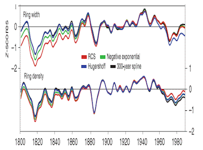
The US records show that the 1930’s were as hot as the 1990’s. And the divergence problem in tree rings is well known. Many tree rings showed a decline after 1960 that didn’t “concur” with the surface records. Perhaps these tree rings agree with the surface records as recorded at the time, rather than as adjusted post hoc? Perhaps the decline in the tree rings that Phil Jones worked to hide was not so much a divergence from reality, but instead was slightly more real than the surface-UHI-cherry-picked-and-poorly-sited records?

Esper - Tree ring widths declined from 1940-1975. Records after 1960 are sometimes ignored because they don't fit the "temperature record". (All timeseries were normalized over the 1881–1940 period. RCS, regional curve standardization; TRW, tree-ring width.) Thanks to ClimateAudit. (Link below)
Steven McIntyre discusses the Esper data here.
Frank Lansner also discusses the data from Scandinavia, which originally showed that temperatures were roughly level from mid-century to the end of the century, but that the large decline from 1940 to 1975 was…adjusted out of existence. (My post on that here).

Scandinavian Temperatures: 25 data series combined from The Nordklim database (left), compared to the IPCC's temperature graph for the area.
Frank points out that while the older graph is not peer reviewed, the modern data sets are also not peer reviewed, so even if the papers they are published in are peer reviewed, it’s meaningless to claim this is significant when the underlying data can be adjusted years after its collection without documentation or review.
The CRU has an FAQ on their datasets, and it includes this comment on the accuracy of the hemispheric records:
In the hemispheric files averages are now given to a precision of three decimal places to enable seasonal values to be calculated to ±0.01°C. The extra precision implies no greater accuracy than two decimal places.
Do I read that correctly? After an adjustment that may be in the order of 0.34°C, the accuracy is ±0.01°C?
At the time when there was a Global Ice Age Scare, this graph appeared in Newsweek.

Newsweek: Global Temperatures 1880-1970 (NCAR)
Either 70% of the decline has been hidden in the years since then, or the climate scientists at the time were exaggerating the decline in order to support the Ice Age Scare (surely not!).
Full references available on Frank Lansner’s & Nicolai Skjoldby’s Blog. Stanley is derived from an NAS document. Mathews from National Geographic.
Thanks to Frank for his good work.


No comments:
Post a Comment